用Flexbox实现整个页面的layout
最近面试了几家公司的front end职位。在这几次面试中,几乎每次面试的css题目中都有涉及到flexbox的layout。可以看出,flexbox在工业界的使用还是很广泛的。(我几乎没有被问到关于float的问题)
这篇文章会总结flexbox的常用技巧,以及适用场景。未来会添加grid system的信息和内容。
本文的实例参考自css grid vs flexbox
两个例子
用于整个页面的layout
假设我们有如下的page design:
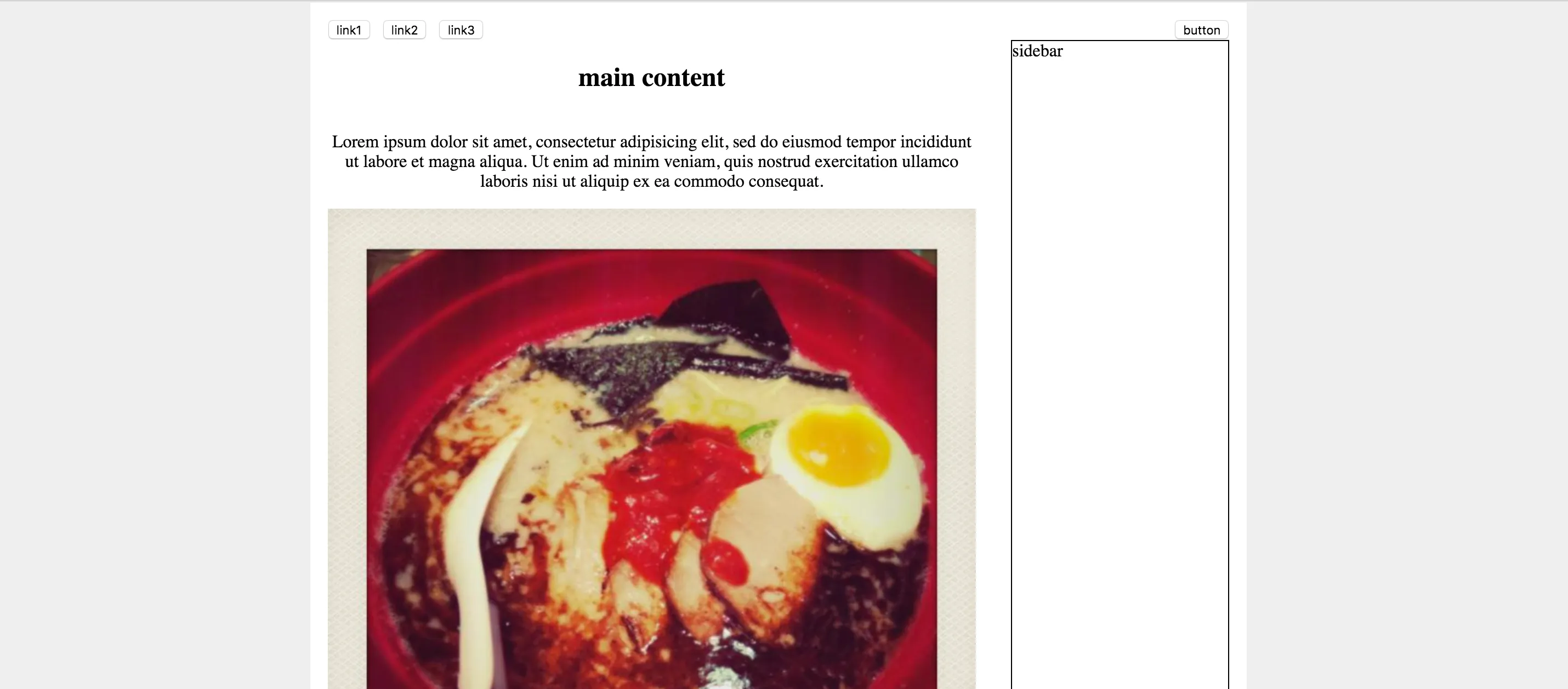
我们可以看到,page上有navbar,main content(分左右两栏),以及footer(未包含在截图中)。这样的layout下可以使用flexbox吗?
当然可以!通过以下几个步骤,即可实现一个简单的layout:
1. 把这几个component放入一个`div`中, 即flexbox的container部分,将其设置为`display: flex`。2. 设置`flex-direction: column`。 这个property可以将flexbox的component放置的位置设置为列。3. 设置`justify-content: space-between`。 这个property的值会告诉浏览器如何计算flexbox中element的间隔和位置。用于某一个小的component的layout
在上例,我们应用flexbox实现一个页面的整体layout。
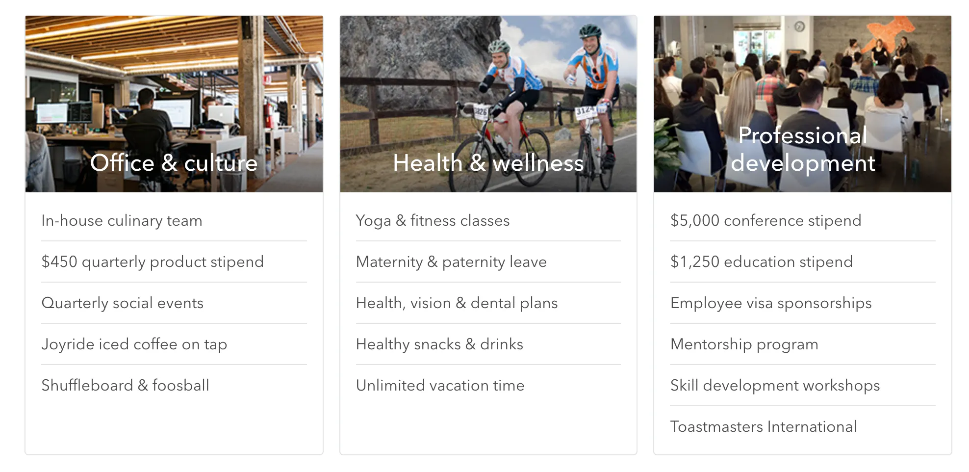
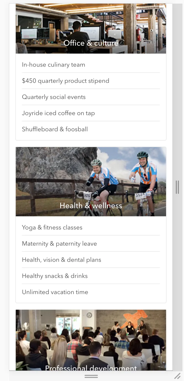
如果我们想做card container的layout,且使其支持responsive design,(design如下图,直接用了Thumbtack网站上的card design截图)
design - big screen
design - small screen
以上layout也可以使用flexbox,且非常简便。
具体的实现如下:
<div class="perks"> <div class="perks--body"> <div class="perks--groups"> <div class="perks--group"> <div class="perks--image" style="background-image: url(https://static6.thumbtackstatic.com/_assets/images/release/pages/jobs/submodules/perks/images/office-22209281.jpg);"> <h2>Office & culture</h2> </div> <div class="perks--list"> <div class="perks--item">In-house culinary team</div> <div class="perks--item">$450 quarterly product stipend</div> <div class="perks--item">Rooftop deck with 360° view</div> <div class="perks--item">Quarterly social events</div> <div class="perks--item">Joyride iced coffee on tap</div> <div class="perks--item">Shuffleboard & foosball</div> </div> </div> <div class="perks--group"> <div class="perks--image" style="background-image: url(https://static7.thumbtackstatic.com/_assets/images/release/pages/jobs/submodules/perks/images/wellness-7fda7cd8.jpg);"> <h2>Health & wellness</h2> </div> <div class="perks--list"> <div class="perks--item">Yoga & fitness classes</div> <div class="perks--item">Maternity & paternity leave</div> <div class="perks--item">Health, vision & dental plans</div> <div class="perks--item">Healthy snacks & drinks</div> <div class="perks--item">Unlimited vacation time</div> </div> </div> <div class="perks--group"> <div class="perks--image" style="background-image: url(https://static6.thumbtackstatic.com/_assets/images/release/pages/jobs/submodules/perks/images/presentation-ede318f4.jpg);"> <h2>Professional development</h2> </div> <div class="perks--list"> <div class="perks--item">$5,000 conference stipend</div> <div class="perks--item">$1,250 education stipend</div> <div class="perks--item">Employee visa sponsorship</div> <div class="perks--item">Mentorship program</div> <div class="perks--item">Skill development workshops</div> <div class="perks--item">Toastsmasters International</div> </div> </div> </div> </div></div>// media query breakpoint$mobile: "(max-width: 900px)";$container-width: 900px;$card-margin-right: 10px;$card-margin-bottom: 8px;$color-gray-light: rgb(232,234,234);$color-gray-medium: rgb(121,120,120);$color-white: rgb(255,255,255);.perks { max-width: $container-width; font-family: sans-serif; .perks--groups { display: flex; flex-wrap: wrap; // support responsive .perks--group { box-sizing: border-box; flex: 1; //设置每个.perks--group的宽度相等 display: flex; flex-direction: column; border: 1px solid $color-gray-light; border-top-left-radius: 4px; border-top-right-radius: 4px; &:not(:last-child) { margin-right: $card-margin-right; } .perks--image { display: block; height: 180px; position: relative; background-size: cover; background-repeat: no-repeat; h2 { text-align: center; position: absolute; bottom: 0; width: 100%; color: $color-white; font-weight: 400; } } .perks--list { padding: 12px 20px; .perks--item { padding: 12px 0; color: $color-gray-medium; &:not(:last-child) { border-bottom: 1px solid $color-gray-light; } } } } }}@media #{$mobile} { .perks { .perks--groups { .perks--group { width: 100%; &:not(:last-child) { margin-bottom: $card-margin-bottom; } &:not(:last-child) { margin-right: 0; } } } }}在使用flexbox时有几个小技巧:
- 当需要设置一个box内的flex component的宽度比时,灵活使用
flex。flex是flex-grow,flex-shrink和flex-basis的简略写法。 align-items可以纵向对其flex-wrap可以强制所有element在一行,或是分成几行。同media-query一起灵活使用,可以实现responsive design
Codepen实例如下:
See the Pen Untitled by Zhe Chen (@chenzhe142) on CodePen.
小结
flexbox非常简单易用,且可以实现非常棒的layout效果,对比float,减少了大量的css的使用,也使代码更易维护。唯一的缺点可以说是实现responsive design,运用media-query时还比较繁琐,需要一点一点地精确调整margin,padding或者其他property的值。
综上所述,flexbox非常强大,值得我们深入学习和应用。